In a world in which beige and neutral seem to rule – whether in interiors or fashion – is there a place for a bright pop of color? The answer is a resounding yes. We talk to top designers to find out the pros and perils of using color and for tips for getting the most out of color in southwestern homes.
Top Designers Give Southwestern Home Color Tips
V&R
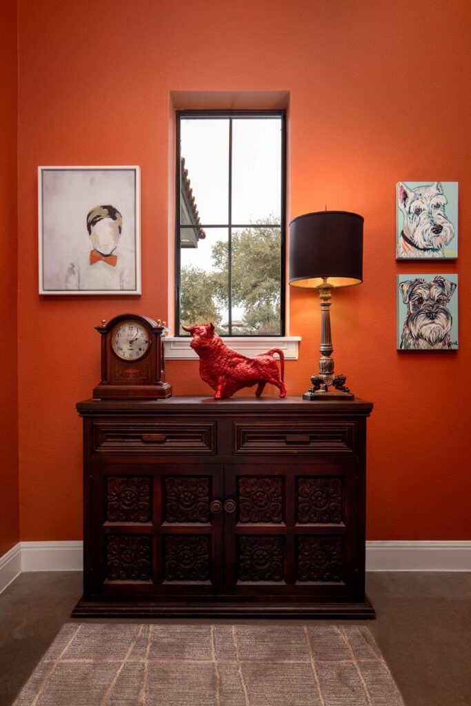
John Hare, co-owner of V&R, describes this mudroom in a modern Spanish revival home as a jewel box. “Since these types of rooms are likely the most well-traveled of spaces in a home,” he says, “I wanted to treat the passerby with a pleasing and energetic color as they arrived and departed.” Color is picked up and repeated to beautiful effect, like the match between the bow tie in the painting with the wall color. “Using vibrant colors can bring energy and life to a room, making it feel dynamic and engaging. For example, a bright wall color can serve as a focal point, drawing attention and creating a sense of excitement.”
Chandler Prewitt
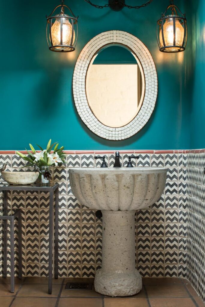
“Our client wanted a fun and unexpected powder room in their traditional pueblo style home,” says designer Chandler Prewitt. “I used saturated turquoise on the upper walls to create a bold, immersive backdrop that contrasts beautifully with the earthy saltillo tiles, hand-painted tile wainscoting, and carved stone pedestal sink.” The challenge was to balance vibrancy with serenity. “The teal offered a strong emotional punch — fresh, confident, and slightly unexpected — while the natural textures and graphic tile provided rhythm and structure,” he says.
David Naylor
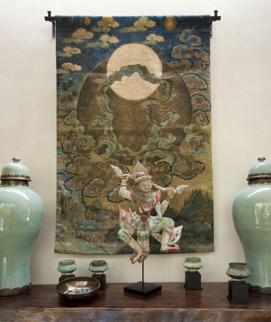
“I access color accidentally,” says designer David Naylor. “Lots of designers like to start with a color conversation with their clients. I start to accrue pieces that I think are perfect for a job and then the color story comes from that,” he says. “I like neutrals on big pieces of furniture, like sofas, because I want the art pieces to speak about color.” For this hallway – what Naylor calls a spine of the house – antique bronze pots that had a verdigris pattern from oxidation that comes with age inspired him. “It has to be kind of mystical and accidental like that. If it’s too forced, it shows.”
Three Roots
An existing rug that was a lush, dark gold color was the starting point for this room by designer Steven Whitehouse of Three Roots Design. He picked up on that color with a curved headboard in “Tulum Gold” velvet. “The client enjoys nature, which is reflected in the scenic green-patterned wallpaper,” he says. Whitehouse feels the southwest welcomes the use of color. “Editing the tones and finding the right balance is the key,” he says.
Susan M. Stella
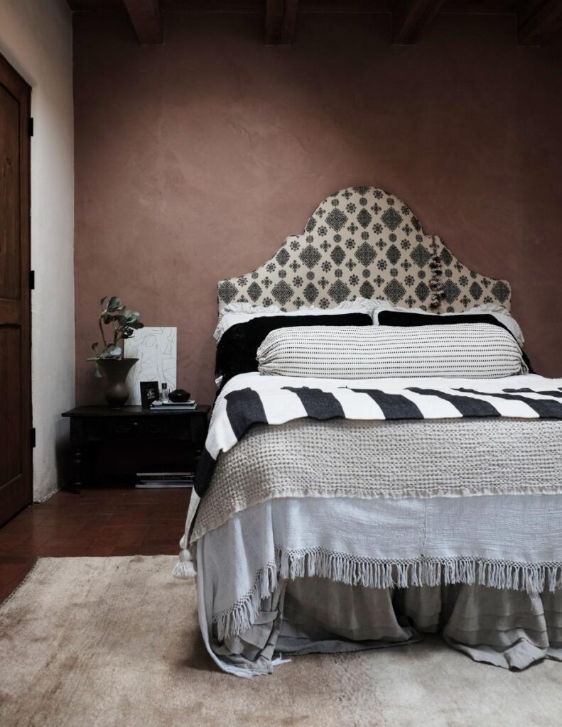
“I wanted to bring the stunning earth tones of the rocky hills around Santa Fe into this interior. To do so, I chose a colored plaster from American Clay and let the terra cotta brick floor blend with the rose, as it does in the hills. I kept the bedding in creams and black for contrasting neutrals.” The interplay between color and neutrals comes from her fine art background, she says. “Often I will throw in strong colors against a more neutral palette for distinction and to draw the eye around the room,” she says. For Stella, the natural light of a region, always plays into color choices. “New Mexico has a very particular, warm light to me. Working with the colors of the stone and dirt of the surrounding hills invites nature inside and gave this room a very grounded and organic feeling.”
French & French
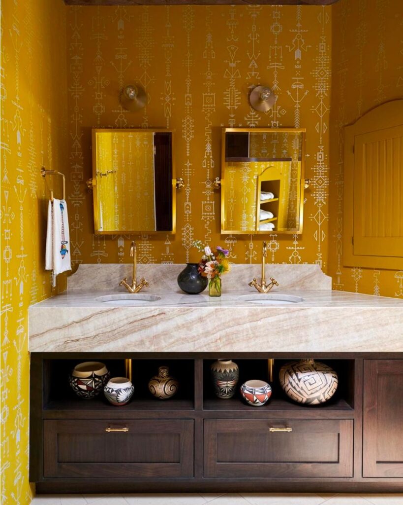
“Aesthetically, our primary goal in designing this home was to infuse it with color, joy, and warmth. This transforms an outdated space that was stuck in a 1990s haze of pale pink-washed wood,” says Heather French of French & French. “In the bathroom, we chose a bold, sunny yellow to contrast beautifully with deep espresso-stained cabinetry. The combination adds both vibrancy and depth, making the space feel both energizing and grounded.” It’s an approach to color that is a cornerstone of their work. “We approach color with boldness and intention, embracing it where others might shy away. That said, we’re thoughtful about the palettes we introduce.”
Jane Smith
When designer Jane Smith purchased her 1930s adobe home in the historic Eastside of Santa Fe, she bought a large Navajo weaving for her new living room. “The weaving is coral with natural browns and grays, so I decided I would use the coral color for the start of my home and garden,” she says. That one piece helped her focus and move forward. “The challenges were to keep the feeling without pieces or colors becoming too overpowering,” she adds. “My walls and vigas are painted white, the floors are a pale grey, both are a blank canvas for adding decor. I love to add color but not take away the overall feel and comfort of a home.”
Story by Julia Platt Leonard
Photography Courtesy of the Designers
Subscribe to TABLE Magazine’s print edition.
